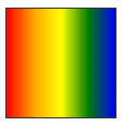
Mozilla has finally released Firefox 3.6, the newest version of its popular browser after months of testing. New Firefox is 20% faster than Firefox 3.5, according to Mozilla. It uses Gecko 1.9.2 web-rendering, which improves its load times, startup speed and stability. Javascript execution is faster and smoother as well. There’s also autocomplete form functionality and full HTML5 support. New feature called Personas has been added in Firefox 3.6 which lets you customize your Firefox with a single click and without a restart. My Favourite feature is the addition of new CSS Gradient API. You can define Gradient effect on any element by specifying simple CSS styles. Thus now you can have CSS Gradient Effect without Images! Note: All the below examples are Images. In order to view the gradient effect one must use Firefox 3.6
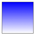
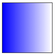
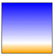
Liner Gradient
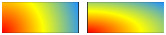
To create a linear gradient, you’ll need to set a starting point and a direction (or angle) for the gradient and to define the color stops.
Starting Point: The starting point works just like background position. You can set the horizontal and the vertical positions as a percentage, in pixels, or using left/center/right for horizontal, and top/center/bottom for vertical. Positions start from the top left corner. If you don’t specify the horizontal or the vertical position, it will default to center. Example
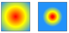
Color stops: Just like with linear gradients, you should define color stops along the gradient line. The following circles have the same color stops, but the gradient on the left defaults to evenly spaced colors, while the one on the right has a specific position for each color.
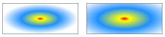
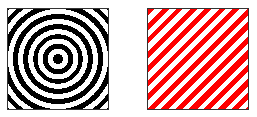
.repeating_radial_gradient_example {
background: -moz-repeating-radial-gradient(black, black 5px, white 5px, white 10px);
}
.repeating_linear_gradient_example {
background: -moz-repeating-linear-gradient(top left -45deg, red, red 5px, white 5px, white 10px);
}
