Bootstrap Navbar Menu without JavaScript – Bootstrap is getting lot of traction since past few years. While many argue it makes web look plain and similar, it has been boon to non-ui developers. The learning curve is also easy and thus you can make good looking web pages in no time.
Update: For Bootstrap 4 example scroll to the bottom of post.
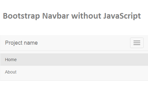
One of most used component of Bootstrap with Navbar. The navbar menu is responsive and adapts to any screen size. For small devices (mobile) the navbar get collapsed and a burger icon appears which can be used to open/close menu in navbar.
To collapse/uncollapse the menu you have to include bootstrap javascript and jquery javascript in your webpage. Sometime this is a little uncomfortable. Say you have a static webpage without any javascript. If you want to show/hide the navbar menu then you have to include all these javascript files unnecessarily. There must be a way of getting away with javascript and still able to use bootstrap navbar? Well there is. You can make bootstrap navbar hide/show for mobile devices without using javascript. Checkout the following code.
The HTML
<nav class="navbar navbar-default navbar-fixed-top">
  <div class="container">
    <input type="checkbox" id="navbar-toggle-cbox">
    <div class="navbar-header">
      <label for="navbar-toggle-cbox" class="navbar-toggle collapsed" data-toggle="collapse" data-target="#navbar" aria-expanded="false" aria-controls="navbar">
        <span class="sr-only">Toggle navigation</span>
        <span class="icon-bar"></span>
        <span class="icon-bar"></span>
        <span class="icon-bar"></span>
      </label>
      <a class="navbar-brand" href="#">Project name</a>
    </div>
    <div id="navbar" class="navbar-collapse collapse">
      <ul class="nav navbar-nav">
        <li class="active"><a href="#">Home</a></li>
        <li><a href="#about">About</a></li>
      </ul>
    </div>
  </div>
</nav>Code language: HTML, XML (xml)
The CSS
#navbar-toggle-cbox {
  display:none
}
#navbar-toggle-cbox:checked ~ .collapse {
    display: block;
}Code language: CSS (css)
So how does this works? First check the html. We added a checkbox and hide it using CSS. Next we changed the button into label and connect the label to checkbox using for="". So whenever you click the burger menu which act as label for checkbox toggles it state. And as per the state of checkbox we show or hide the content.
Online Demo – Bootstrap Navbar Menu without JavaScript
Below is the demo, click on the burger menu button to toggle navbar menu.
JSFiddle: https://jsfiddle.net/viralpatel/2w1owayn/
Bootstrap 4 Navbar without JavaScript
You can do the same with Bootstrap v4 which is still in alpha at the time I am writing this. Below is the fiddle preview.


Wow I had no idea you can make bootstrap navbar hide/show for mobile devices without using javascript.
Thanks a lot for this!
Hi, thx for the info but this breaks dropdown in the nav
thanks for sharing. i am going to implement on my site.
how simple but functional, never heard of this pseudo checkbox thing before.
Thank you
Thanks for sharing good one
Not sure if it’s too late to post on this. But I noticed the Bootstrap 4 example seems broken and was wondering if it could be updated. Thanks!
I am using Bootstrap 4.5.0 and the example you have for BS 4 Alpha does not work. It shows the checkbox which toggles checked and unchecked but that is all that happens.